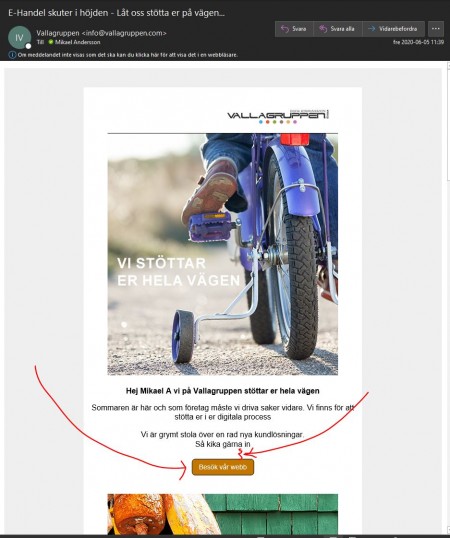
Outlook is one of the most widely used clients in the world and your newsletters get ugly in the Outlook client.
I have set buttons to be without rounded corners but nevertheless the buttons show rounded corners and with an ugly border in Outlook client.
I've used "space" between a text block a button but it doesn't show at all. Need to do a workaround creating a "title" block without text 16px. That is the way to get space between a button and a text block.
Please can't you get your newsletter look right in the Outlook client? It is used by extremely many users.
Feels like it's time for you to get it in version 6 now, since it's been live for a long time now.
It's so annoying to have to work with lots of work around to make it look reasonable.
Kindly - Mikael A - Vallagruppen
