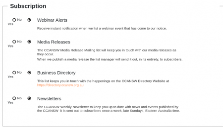
I have users complaining about the confusing layout of the front end subscription panel. They say they can't decide which is YES, which is NO:

https://ccansw.org.au/images/stories/acymailing/screenshot-news.ccansw.org.au-2021.07.29-10_21_06.png
We're getting it in Chrome & FF (tested) at various zoom levels including 100%.
Is there anything that can be done about this?
PS: What's the magic spell to insert images into this editor?
