Alexandre
Hi Alexandre,
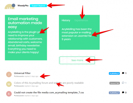
@WoodyF4u has a point here. The light blue, light green and light grey against white backgrounds (or vice versa) have a low contrast ratio making it for a lot of people hard or impossible to read.
The contrast ratio is app. 1,76:1 where you should try to have a minimum 4,5:1 contrast ratio according the WCAG 2.0 level AA guidelines. You can read more about it here: https://www.w3.org/TR/UNDERSTANDING-WCAG20/visual-audio-contrast-contrast.html
In the attached file you'll find some examples WoodyF4u is referring to.
I can imagine all your priorities are at Acymailing v6 (and they sould), but it is good to keep this in mind and to improve it when you have some spare time.
Best regards,
Joep